a little Photoshop before and after
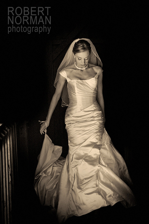
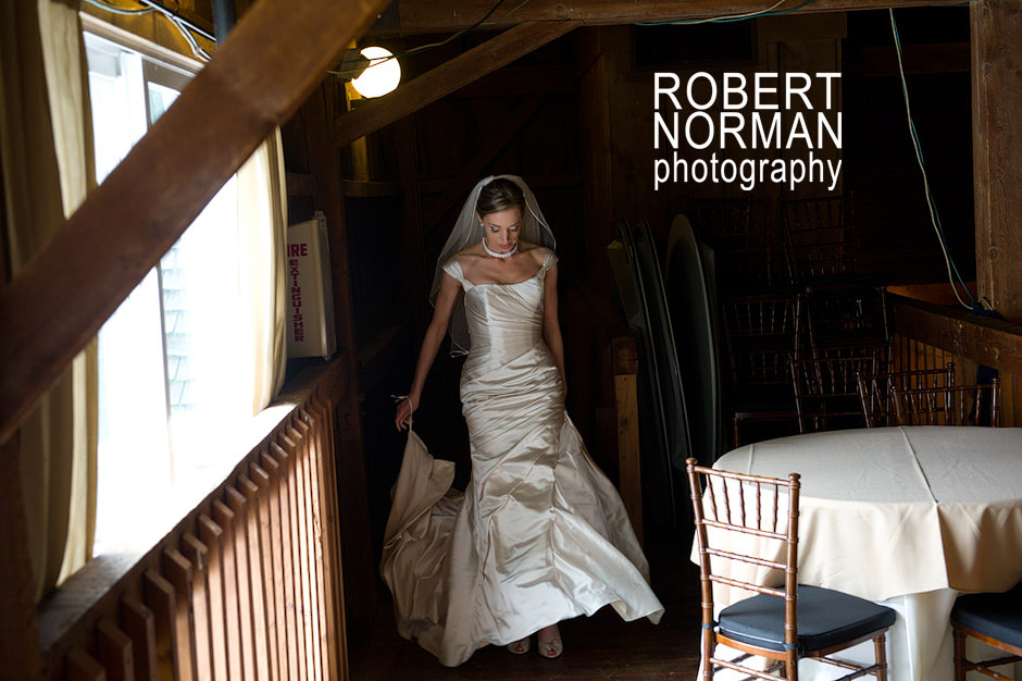
I havent posted a Photoshop ‘before and after’ in quite some time, but thought this image was a prime example of grabbing something cool out of a ‘throwaway’ shot. The original – seen at the bottom – had chairs and crap lying around, a bright light above as well as a fire extinguisher box to the left. I almost ignored it as a useable image until i just focused on Melissa’s pose and body language. I thought “..this might be worth playing with!”
Now for some people, the final image will be WAY too manipulated and fiddled with- and to some level I AGREE —however I think providing something a little ‘artsy fartsy’ now and then is fine and very often appreciated, and shows your client your artistic side, above and beyond your photographic eye. Don’t be afraid to occasionally crop like crazy and get in there and darken/remove annoying parts to make it the image you REALLY want!! (Would I want an entire event to look this way? Nope.)
So Photoshopper’s– consider trying this now and then and have some fun – I’ll bet you’ll be surprised what you can snag out of an image you were ready to delete, and I bet you’ll have a happier client to boot!


I love seeing these type of posts – great job!
This is great!
I love these, too! I would have never guessed that first shot came from this original. Nice!!
That’s a great finish product, and I bet the bride loves it!
What’s Photoshop?